‘Liquid’ Font Family for Very Small Displays
|
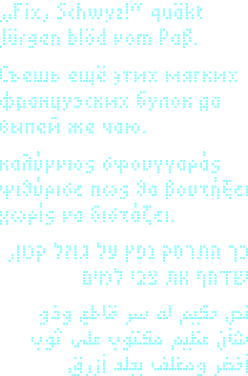
The Liquid Font Family is a collection of small bitmap fonts to be used on small displays, e.g. LCD displays on HTPCs, mp3-players, status displays on phones, printers, remote controls, etc.etc. The overall goal is to provide nice-looking, very readable fonts that allow displaying a lot of information. So in contrast to most other bitmap font projects for tiny fonts, Liquid fonts are proportional fonts, not mono-spaced, because more characters can be displayed horizontally this way, and it also looks nicer. This means they require graphics capable displays. In particular, they are not primarily for 5x7 pixel LCDs, which have hardwired(=missing) horizontal and vertical empty pixel rows and columns to separate characters and lines. The main work of the Liquid family is ‘Liquid Mean’. This font is a font with a height of 8 pixel which additionally focusses on good Unicode support. Currently, it already supports Latin, Greek and Cyrillic for a few hundred languages. It implements a superset of the European MES-2 standard, a recommendation for European Latin/Greek/Cyrillc fonts to support the vast majority of European languages, including most minor languages. Liquid Mean goes beyond that. The support includes many more languages, even those which require a vast amount of accents and diacritic marks, like Ancient Greek, Vietnamese, and Mandarin Chinese Romanisation. Liquid Mean explores what amazing things can be done on a very limited display with max. 8 pixels vertically per character. There is an overview of supported languages. The fonts are currently in a proprietary text format, which can be converted to include files for C/C++. Other font formats will be added later. The current distribution is suitable for programmers, but not for end users. For easy integration, a small but complete and portable rendering library for C/C++ is implemented, which converts UTF-8/16/32 texts into a bitmap with high-quality rendering algorithms. E.g., my HTPC uses this library. |
|
Download Liquid Font Family |
※ |
The fonts and the library are both self-contained.
The font package includes the source files for the fonts, the additional Unicode data files, and the font converter that reads the font files and can generate several different output formats, including include files for C.
The library package contains the source files for the library, and the converted fonts in C format, so it is ready to compile. You need cmake to compile out of the box, but since the library does no fancy things, compiling manually or writing a simple Makefile is just a matter of minutes. cmake is recommended, however.
| Current Versions | |
|---|---|
| Snapshot (unstable) | [ Download Fonts | Download Library ] |
| Version 2.0 (stable) | [ Download Fonts | Download Library ] |
| Old Versions | |
| Version 1.0 (stable) | [ Download Fonts ] |
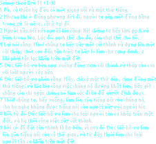
Examples |
※ |
Comparison |
※ |
| Liquid Minus | 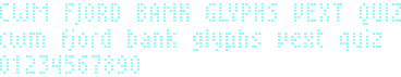
|
|
|---|---|---|
| Liquid Sting | 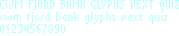
|
|
| Liquid Mean | 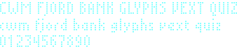
|
|
| Liquid Wee | 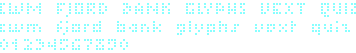
|
Minus, Mean and Sting use the same upper case letters. Minus and Sting are mainly for ASCII, Mean is international.
Minus has larger lower case letters; for some people, they might be slightly easier to read from a distance, but the difference to upper case letters is quite small.
For one-line pure ASCII displays, Sting has the best balance in its lower case letters, because it allows two pixels for ascenders and two for descenders rendering gjpqy just as nicely as dbfhkl, which neither Minus nor Mean can afford: their descending lower case letters look less pleasant (compare the word ‘glyphs’).
Note, however, that Sting uses the full 8 pixels even for ASCII, so on 16 pixel two-line displays, the letters from different lines might touch (look at ‘fjord’ and the ‘5’ below it).
This problem is solved by Mean, which keeps one pixel line space for all ASCII letters. The compromise is to allow only one pixel descenders, so on one-line displays, gjpqy will look less nice. But Mean has other advantages, namely a comforting space of three pixels for diacritics above for lower case letters. So this is the font of choice for supporting more Unicode than Minus or Sting can possibly do.
Finally, Wee is an experiment of how small letters can be made while still being reasonably nice.
Liquid Mean |
※ |
Overview |
※ |
| Tables of all characters (PDF) |
| List of Unicode blocks |
| List of language support |
| List of conflicts due to identical glyphs |
Examples |
※ |
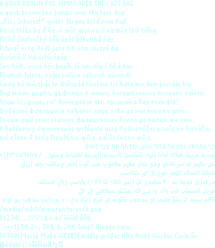
The following samples were rendered with a 2 pixel gap between lines to visually improve separation of the lines. Depending on the vertical size of your display, this may be feasible or not (you would not want to do it on a 16 pixel display).
Bugs |
※ |
There are languages where distinct characters use the same glyph. The number of such conflicts was tried to be kept low, but it is very hard to create perfectly disjoint sets at such a small scale.
A list of conflicts is automatically generated to find such problems.
Rendering Library |
※ |
The Liquid font rendering library is a small C/C++ library with which Unicode text can be rendered into a bitmap. The design goals are portability, ease of use, and efficient space management.
The following list of advanced features gives an overview of what the library can already do:
- Support for ISO-8859-1 (Latin-1), UTF-8, UTF-16, and UTF-32.
- Paragraph and line breaking. Currently, no automatic line breaking is done, only explicit line breaks are handled. (However, the library was internally designed with a future automatic line breaking algorithm in mind.)
-
Automatic ligature selection. E.g. for Latin: 'f'+'i' -> 'fi' and in Arabic, 'Lam+Alef' -> 'LamAlef'. Arabic in Liquid Mean will be extended in the future to include more ligatures, because by this we can save horizontal space.
Ligatures can be forced with ZWJ (e.g. 'a'+ZWJ+'e' -> 'æ') or probihited with ZWNJ (e.g. 'f'+ZWNJ+'i' -> 'fi'). Even ZWJ+ZWNJ+ZWJ is implemented the way Unicode dictates.
- Automatic kerning. Some letters in Liquid Mean have alternative glyphs to enhance autokerning.
-
Full bidirectional support (needed for Hebrew and Arabic).
Since this is a large module (several kilobytes), it is optional, so if you do not need it, you can save some space.
Changes |
※ |
License |
※ |
This font is distributed under the GNU General Public License, Version 3, with an exceptional clause for embedding fonts into documents.
If you want to license the font under different terms, please don't hesitate to contact me.