| « 2020-10-15 | Tinkering | 2020-06-06 » |
Tinkering: 2020-06-14: Kitchen Wall Clock Beautification
The clock face of our kitchen wall clock was really in bad shape for a while. That thing is well over a decade old and the clock face is a thin plastic sheet not made for eternity. It was cracked all over and the cracks opened so we could look into the black void behind it. Something needed to be done.
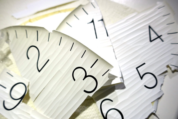 This is the old clock face after removal. It crumbled into a lot of
pieces and made a big mess. I had to vacuum the remains.
This is the old clock face after removal. It crumbled into a lot of
pieces and made a big mess. I had to vacuum the remains.
I should have done this repair earlier: this is a simple font and a simplistic clock face, but it's not nicely simplistic. Looking at the font now, it is disproportionate, e.g., the '6' bulges in weird places.
I thought I can improve the appearance a bit.
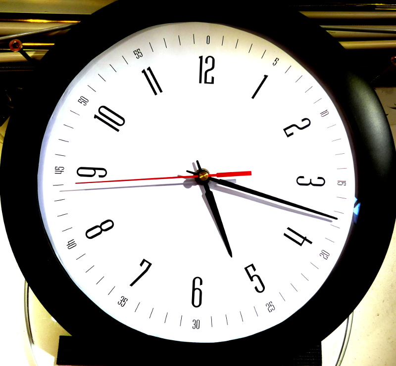
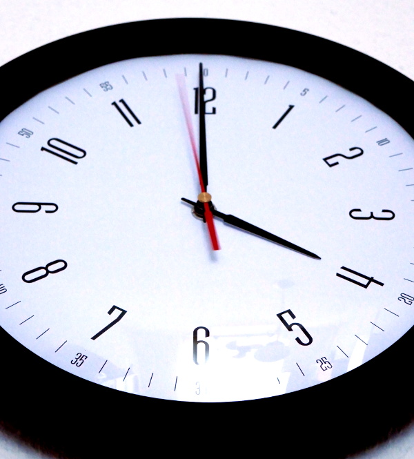 This is the new clock face. It's simply printed on two sheets of A4
paper joined in the middle. It needed to be joined because the clock
face is 248mm in diameter and A4 is only 210mm wide, and I have no A3
printer. The joint came out almost invisible, so this is good.
This is the new clock face. It's simply printed on two sheets of A4
paper joined in the middle. It needed to be joined because the clock
face is 248mm in diameter and A4 is only 210mm wide, and I have no A3
printer. The joint came out almost invisible, so this is good.
The new clock face is loosely based on several watches: the Nomos Glashütte Tangente, with some influence from the Welly Merck Defender Roma S, the IWC Portugieser IW371446 and the Laco Classic Halle. And about a hundred other watches. I won't put pictures here to avoid copyright infringement, so just use an image search.
One thing I noticed was that clocks seem to often have a peculiar shape for the '4' digit: closed, but flat on the top instead of pointed. I compared hundreds of fonts on identifont.com, but found only very few similar '4's. I suppose this is a common font modification for clocks, and it does remind me of grandfather clocks somehow. The font I finally used does not have this feature, though, but uses an open '4' shape.
Most of this project was researching clock faces. I am a fan of simplistic clock faces. And since I was investigating wrist watches anyway, I had an excuse to look at even more clock faces.
 A wall clock is not a wrist watch, so the proportions of the digits
surely need to be a little different, but I still largely stuck with
the condensed fonts of many of the watches to avoid a feeling of alarm
clock and train station clock.
A wall clock is not a wrist watch, so the proportions of the digits
surely need to be a little different, but I still largely stuck with
the condensed fonts of many of the watches to avoid a feeling of alarm
clock and train station clock.
For the same esthetic reason, I tilted the digits depending on the hour position instead of leaving them upright.
There are also conflicting feelings: while I do like the Nomos a lot, at the same time it nags me when the digits are at every second hour (12, 2, 4, 6, 8, 10) also on the Welly Merck. Every third hour (12, 3, 6, 9) is OK, but every second hour feels wrong. Also, I really do not like it when digits are replaced by additional displays, like when a calendar or a seconds display replaces a 3 or a 6. Our wall clock has none of these additional displays, so I don't need to worry. As you can see, I decided on digits at each hour.
There are also minutes printed at each five minutes like on the Nomos, the Welly Merck, and the IWC. I used the same font as for the hours to keep the minutes small and condensed, so this looks different from the Nomos. What also nags me is printing '60' at the 12 hour position; there is no second '60' (unless a leap second is inserted). There should be a '0'. And using '05' also feels unnatural and should be a simple '5'.
The result is nice, I think. For a quick repair of our kitchen clock, I think it came out well.
Technically, this project was easy: disassemble, swap the clock face, reassemble. OK, and replace the battery while we're at it.
For drawing the clock face, I used XFig and rendered it with Xelatex so I could include arbitrary TTF fonts.